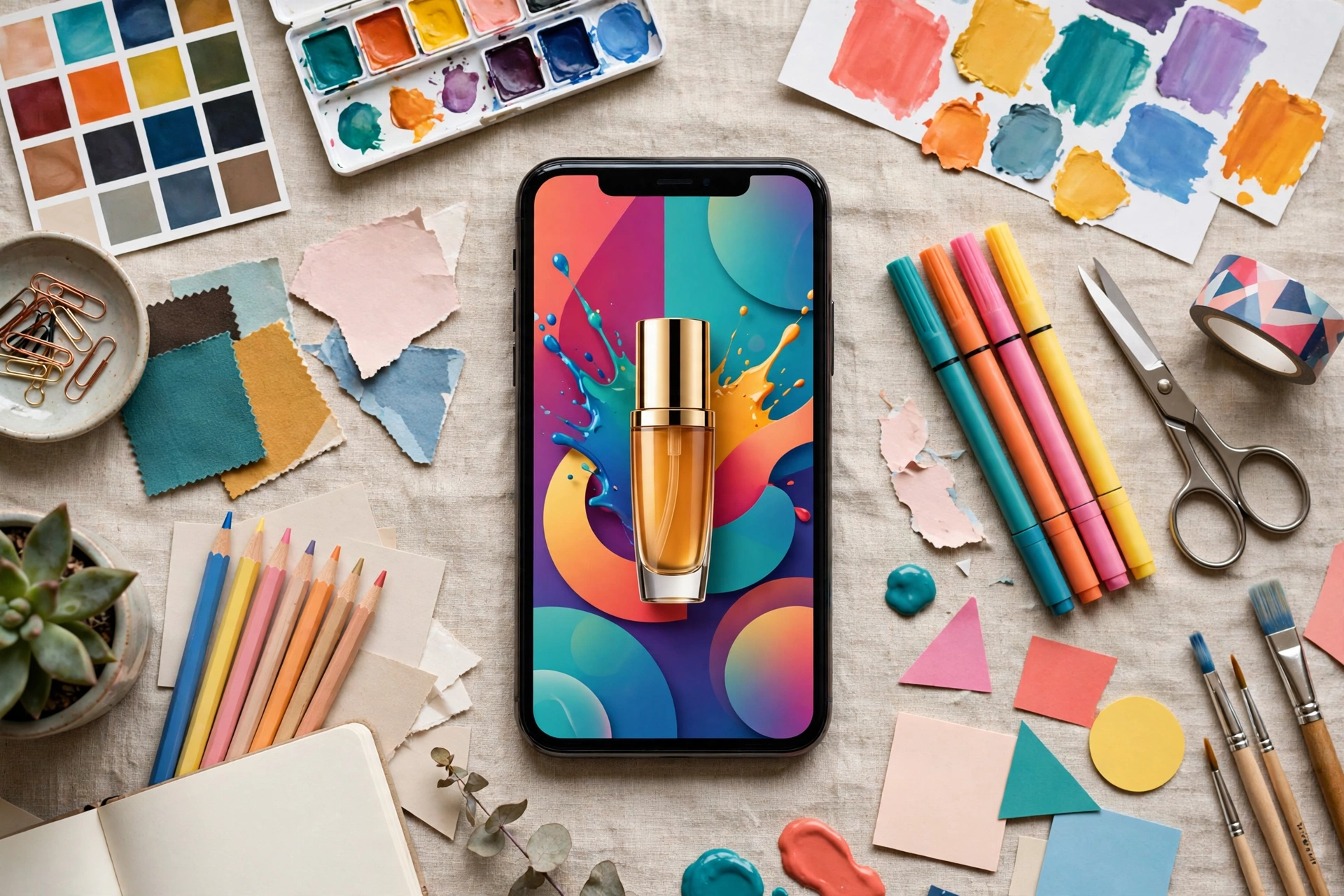
Your ad has roughly a second to earn a second look. On Instagram, people do not browse ads — they scroll past them, fast, while doing something else. That is why Instagram ad design services Pakistan is not really about making a pretty image. It is about designing a creative that stops the thumb, delivers one message, and makes the next tap obvious.
This guide covers the seven elements that separate ads people skip from ads people act on. It is written for paid Instagram advertising specifically — the creatives that run behind ad spend — not for organic feed posts, which play by different rules.
Why most Instagram ads get scrolled past
Most skipped ads fail in the same few ways. The image looks like a generic poster. The message tries to say five things at once. The product appears only at the end. The offer is unclear. Or the ad promises one thing and the landing page delivers another.
None of these are design talent problems. They are structure problems. A scroll-stopping creative is built in a specific order: hook first, message second, proof third, action last. When that order breaks, attention breaks with it.
Element 1: A hook that works in the first second
The hook is whatever the eye lands on first — usually the headline, the main image, or the first frame of a video. It has one job: make someone pause.
Good hooks are specific. They name the result, the problem, or the person the ad is for. “Flat shoes that survive a full day in Lahore’s summer” will outperform a generic “Premium footwear collection” because it speaks to a real situation. Vague hooks like “Best quality, best price” say nothing to anyone and get scrolled past by everyone.
If you can only fix one thing about your ads, fix the hook. Everything else only matters after someone stops.
Element 2: One clear message per creative
Every ad should say exactly one thing. One product, one benefit, one offer, one audience.
When an ad tries to promote a sale, a new collection, free delivery, and a brand story at the same time, the viewer absorbs none of them. Split the messages across separate creatives instead. Your campaign can carry many messages; each individual creative should carry one.
This is also what makes testing possible. If an ad has one message and it fails, you know what failed. If it has five, you learn nothing.
Element 3: Visual hierarchy the eye follows naturally
Visual hierarchy is the order in which the eye reads your creative. In a strong ad, the eye travels: hook, then product, then offer, then call to action. Nothing competes with anything else.
In practice, that means: one dominant element, not three. Headline large enough to read on a phone without zooming. Product clearly visible, not buried behind decorative graphics. Supporting text small and brief. And breathing space — crowded creatives feel like work to read, and people skip work.
Design your creative at phone size, not desktop size. If it cannot be understood on a small screen in two seconds, it will not be understood at all.
Element 4: The product in the first frame
For product ads, show the product early and clearly. This sounds obvious, yet many ads open with a lifestyle scene, a logo animation, or a model shot where the product is barely visible.
People buy what they can see. Show the product in use, show the detail that makes it different, and show it at a size the eye can actually register while scrolling. For services, the equivalent is showing the outcome: the result, the transformation, or the moment the service delivers.
If your product only appears at the end of a video, most viewers will never reach it. Put it first.
Element 5: An offer people can understand instantly
An offer is not the same as a discount. Free delivery, a bundle, a limited-time bonus, or a clear starting point can all be offers — but only if the viewer grasps them immediately.
State the offer in plain words. Avoid asterisks, conditions, and fine print in the creative itself; those belong on the landing page. If the offer needs a paragraph to explain, it is not an offer yet — it is a puzzle, and puzzles get skipped.
One caution: an offer that attracts the wrong buyers is worse than no offer. A deep discount that pulls bargain hunters who never return costs more than it earns. Match the offer to the customer you actually want.
Element 6: Proof that feels real
People trust ads more when someone else seems to have already trusted the brand. Reviews, ratings, real customer photos, and honest user-generated content all work as proof — provided they are genuine.
Use real proof only. Never invent testimonials, ratings, or customer counts. A single authentic customer photo with a real comment outperforms a polished graphic claiming popularity nobody can verify. And keep proof secondary: it supports the message, it does not replace it. An ad that is all proof and no offer still gives the viewer nothing to do.
Element 7: A call to action that matches the landing page
The call to action is the bridge between the ad and the sale — and it only works if the landing page continues the same promise. An ad that says “Order now” but lands on a homepage forces the visitor to search for the product themselves. Most will not bother.
Match the CTA to the page: “Shop the collection” should land on that collection. “Book a free consultation” should land on a booking form, not a generic contact page. This match is also why some ads get clicks but no sales — the creative did its job and the landing page undid it. If that sounds familiar, our guide on Meta ads clicks but no sales walks through exactly where those clicks leak away.
Formats: feed, story, and reel ads are not interchangeable
The same creative does not work everywhere. Feed ads allow more reading time and suit detailed offers. Story ads are full-screen and fast — they need bigger text, faster hooks, and vertical framing. Reel ads behave like content, not posters: they need movement, captions, and a hook in the first frame.
Designing one square image and stretching it across all placements is the most common waste of ad spend in paid social. Adapt the creative to the placement, even if the message stays the same.
The mistakes that quietly kill performance
A few patterns show up again and again in underperforming ad accounts:
Logo-first design. Your logo is not the hook. Lead with the benefit, and let the brand mark sit quietly in a corner.
Text-heavy images. If the creative reads like a paragraph, it will be treated like one — skipped. Put detail on the landing page.
Weak or missing CTA. “Learn more” on an ad that needs a purchase, or no CTA at all, leaves interested viewers with nowhere to go.
One creative for everyone. Different audiences need different hooks. A single creative shown to cold and warm audiences alike will underperform for at least one of them.
No testing plan. Running one creative and judging the whole campaign by it tells you almost nothing. Run variations, change one element at a time, and let the data decide. Our guide to creative testing on small budgets explains how to do this without burning your budget.
FAQ
How many ad creatives should I run at once?
Enough to test, few enough to read the results. For a small budget, a handful of variations around one message beats dozens of unrelated creatives, because you can actually tell which element made the difference.
Should my ad creative match my organic posts?
It should match your brand, but not copy your organic style. Organic posts build familiarity over time; paid creatives have one second to earn attention from strangers. Different jobs, different designs.
Do I need video, or are images enough?
Both can work. Video suits demonstrations, transformations, and personality-led products. Images suit clear offers and products that sell on appearance. Test both for your product rather than assuming one is always better.
How often should I refresh my ad creatives?
When performance drops or the audience has seen the same creative too many times — not on a fixed calendar. Watch frequency and results together; refreshing too often also wastes the learning your campaign has built up.
The bottom line on Instagram Ad Design in Pakistan
Scroll-stopping Instagram ad design is not a mystery and it is not a talent contest. It is seven elements in the right order: a specific hook, one message, clear hierarchy, the product up front, an understandable offer, real proof, and a call to action that lands where it promises.
Get those right and your ad spend starts working for you instead of against you. Get them wrong and even the best targeting cannot save the campaign.
If you want creatives built this way for your brand, see our services overview and contact us for an exact quote. Tell us your product, your audience, and your offer, and we will build the creative around the one message that matters.
Get a free consultation
Want a second pair of eyes on your ads? Chat with KlikNest on WhatsApp – free consultation, no spam, ever.
Chat on WhatsApp

Leave a Reply