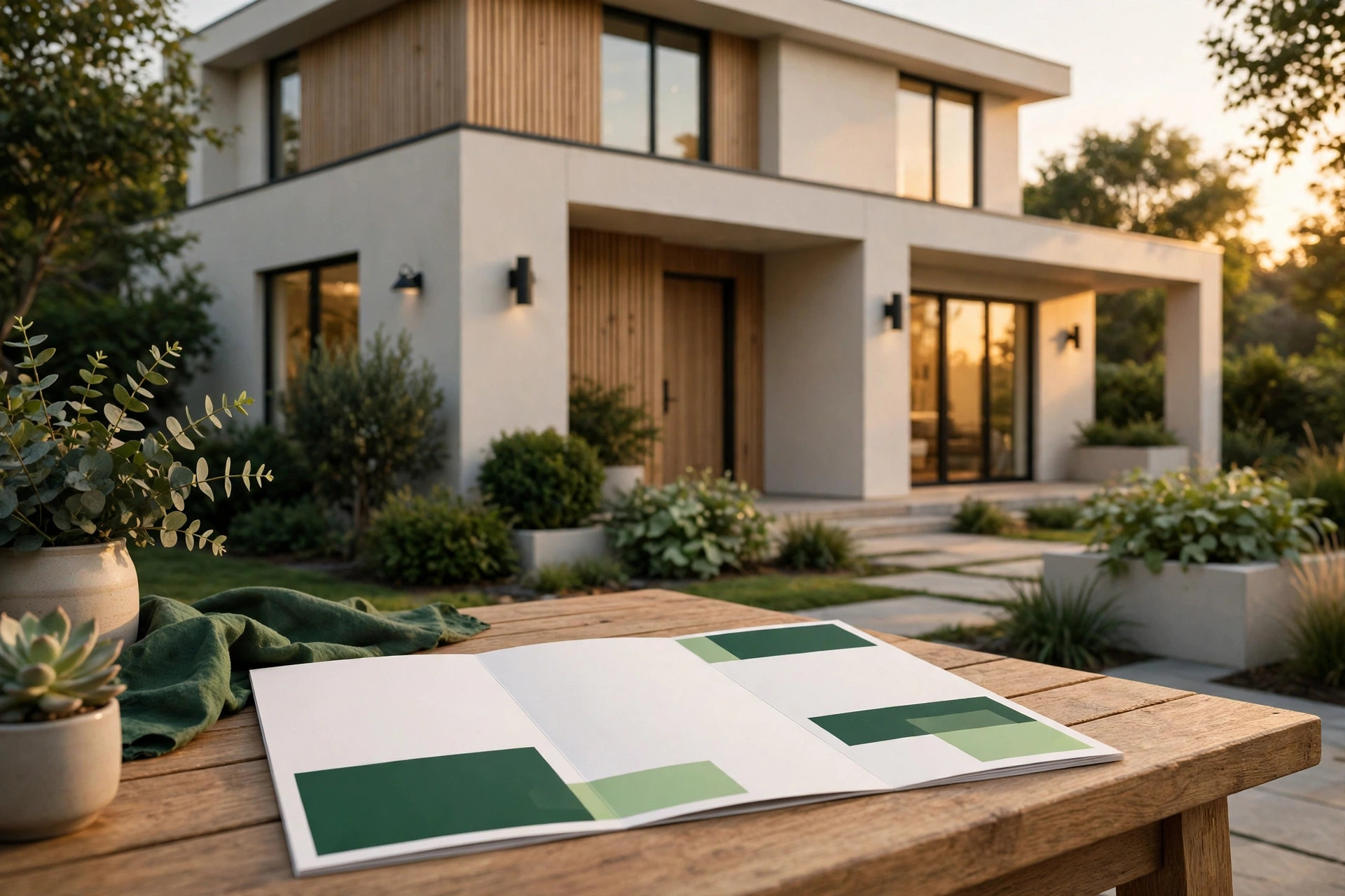
A property brochure has exactly one job: to make the reader want to see the property in person. Not to admire the design, not to read a long description, not to keep the brochure — to book a site visit. Every choice in real estate brochure design should be judged against that one job. A beautiful brochure that produces no visits has failed. A plain one that fills the viewing schedule has succeeded.
This guide covers what actually makes a property brochure work in Pakistan: the photos, the layout, the words, the price, and the next step. It applies whether the brochure is a printed handout at a site office or a PDF shared on WhatsApp — the job is the same, and the reader is the same person deciding whether this property is worth their time.
Start with the job, not the design
Before choosing colours or layouts, answer three questions about the reader. Who is this brochure for — a family buying a first home, an investor, a business looking for commercial space? What do they care about most — location, size, price, or the payment plan? And what should they do after reading — call a number, visit the site office, or scan a code to see the location?
The answers shape everything. A brochure for a family home leads with the living spaces and the neighbourhood. A brochure for an investor leads with the numbers and the rental potential. A brochure for a commercial plot leads with the location and the access roads. A brochure that tries to speak to everyone at once speaks clearly to nobody, and the reader puts it down without acting.
Photos: honest, well-lit, and of this property
Photos are the reason most readers pick up a brochure, and the reason most put it down. A buyer who visits a property that looks nothing like its brochure does not just lose trust in the brochure — they lose trust in the seller. Real estate brochure design lives or dies on whether the photos are honest.
Use real photos of the actual property, taken in good daylight, with the rooms clean and the curtains open. The hero photo — the one on the cover — should be the property’s best real angle: the front elevation, the living room, or the view that sells the place. Follow it with the rooms that matter most to the buyer: the main bedroom, the kitchen, the bathroom, and any outdoor space. A floor plan matters as much as photos for many buyers, because it answers the question photos cannot: how the space actually flows. What to avoid: stock photos of other properties, photos taken years ago when the property looked different, and heavily edited images that hide real flaws. A buyer will see the truth at the visit anyway — the brochure’s job is to get them there honestly, not to trick them into coming.
Layout: one clear path from cover to contact
A good brochure reads in one direction, like a short walk through the property. Cover: one strong photo, the project or property name, and one line that says what it is and where it is. A cover crowded with features, logos, and promises is a cover nobody reads. The highlights: the facts a buyer asks first — location, total area, number of bedrooms and bathrooms, and the one or two features that set this property apart. Inside the property: photos and a floor plan, in the order a visitor would walk through, each photo with a short caption saying what the reader is looking at. Location and surroundings: a simple map and the distance to the places buyers actually ask about — schools, hospitals, markets, main roads. Do not list landmarks that are a long drive away as if they were next door; buyers check. Price and payment: the price, stated plainly, and the payment plan if there is one — booking amount, instalments, and possession timeline. A brochure without a price forces the buyer to call just to learn the most basic fact, and many will not bother. Contact and the next step: a name, a phone number, the site office address, and the visiting hours, with one clear action — “Call to book a site visit.” This page should be impossible to miss.
The words: short, specific, and honest
Property brochure copy fails in two ways: it says too little, or it says too much in the wrong language. The words should do three things and nothing more: name the property and the location, state the facts, and tell the reader what to do next. Use the numbers buyers actually compare: covered area, plot size, number of rooms, floor, facing direction, and possession status. Write the location as people say it — the area name, the nearest well-known road or landmark — not as a formal address nobody recognises. Avoid superlatives the brochure cannot prove: every property cannot be “the best” and “luxury” at the same time, and readers have learned to ignore those words entirely. A specific sentence — “a corner plot, two streets from the main boulevard, with gas and water connections in place” — sells more than a page of adjectives.
Print or digital: use both, for different moments
A printed brochure suits the site office and the property expo: something a visitor can hold, take home, and show to their family. Print quality matters here — a flimsy handout suggests a flimsy project, while a solid, well-printed brochure suggests a developer who takes the work seriously. That impression is part of the sale.
A digital brochure — usually a PDF — suits everything else: it is shared on WhatsApp, attached to an email, and linked from a social media post or an ad. It should be light enough to download on a normal mobile connection and readable on a phone screen, which is where most buyers will open it. A QR code on the printed brochure that opens the location on a map, or the digital version with more photos, connects the two: the print piece starts the interest, the phone finishes the job. The two versions must agree. Same photos, same price, same facts. A buyer who sees one price on the PDF and another at the site office has a reason to walk away. Good real estate brochure design keeps print and digital in step, so the buyer never meets two different stories.
The mistakes that kill site visits
Photos of a different property. The fastest way to destroy trust. If the property is under construction, show the construction honestly — the structure, the progress, the model or the floor plan — rather than photos of a finished home somewhere else.
No price anywhere. Buyers compare prices before they compare properties. A brochure that hides the price is a brochure that gets skipped in favour of one that states it.
No clear next step. A brochure that ends with a logo and no phone number, no visiting hours, and no invitation to act is a brochure that ends the conversation. The reader should never have to search for how to book a visit.
Too much on every page. Crowded pages with small text, many photos, and competing headlines make the reader give up. One idea per page, generous empty space, and photos large enough to actually see: the brochure should feel calm, not desperate.
Outdated facts. A brochure that still shows last year’s price, a sold-out floor, or a possession date that has passed tells the buyer the developer does not keep its own promises current. Update the brochure the moment a fact changes, in both print and digital versions.
How the brochure fits the rest of the marketing
A brochure rarely works alone. It is usually the piece a buyer receives after seeing an ad or a social post, and the piece they take home after a visit. That means it has to match the other pieces: the same photos and price as the ad that brought the buyer in, and the same facts as the posts they will see afterwards.
The ads that bring buyers in are often Meta ads aimed at property seekers — our guide to Meta ads for real estate in Pakistan explains how those campaigns target buyers rather than clicks. The social posts that keep a project visible between visits follow the same discipline: our guide to social media post design in Pakistan covers what makes a post actually grow a page instead of just filling it. The brochure sits between the two — the detailed, take-home version of the same story the ads and posts tell briefly. Our broader guide to brochure design in Pakistan covers formats and the general principles that apply to any brochure. This article is the property-specific version: the same craft, aimed at one outcome — a booked site visit.
FAQ
How many pages should a real estate brochure be?
Enough to cover the property honestly and no more. A single property usually needs a handful of pages: cover, highlights, photos and floor plan, location, price and payment, and contact. A large housing project with several house types needs more, but every extra page must earn its place by answering a question the buyer actually asks.
Should the brochure show the price?
Yes, in almost every case. Buyers compare prices first. Hiding the price does not create curiosity — it creates a reason to choose the competitor’s brochure, which states it. The only exception is a property sold by invitation or negotiation, and even then the brochure should say how the price is discussed.
Print or digital — which one first?
Digital first, because it is cheaper to update and easier to share. Prepare the PDF, share it, and print only when the facts are settled and the property is ready to show. Printing early and then changing the price means reprinting the whole run.
What if the property is still under construction?
Show it honestly: the structure as it stands, the construction progress, the floor plan, and the expected possession timeline. Buyers of under-construction property are buying a plan as much as a building — the brochure should sell the plan with real drawings and real dates, not with photos of someone else’s finished home.
The bottom line
Real estate brochure design is not about making a pretty document. It is about making a document that books site visits: honest photos of the actual property, a layout that walks the reader from the cover to the contact page, the price stated plainly, and one clear next step. Get those right and the brochure earns its keep — it turns a person who was browsing into a person standing at the site office, ready to look around.
If you want a property brochure built this way — photos, layout, words, and print and digital versions that agree — see our services overview and contact us for an exact quote. Tell us about the property, who the buyers are, and whether you need print, digital, or both, and we will build the brochure around the visit it needs to book.
Get a free consultation
Want a second pair of eyes on your ads? Chat with KlikNest on WhatsApp – free consultation, no spam, ever.
Chat on WhatsApp
Leave a Reply